Good Morning Everybody,

Today is our first somewhat easy day in the last 10 days so we are looking forward to having a few less busy days ahead of us till next week. I really enjoy presenting my Captured By The Light program and we always enjoy the folks we meet during our tour travels.
We open the doors at about 5:00 p.m. this evening and will have our good friends from OnOne Software on hand to preview all the cool new features of their brand new Perfect Suite which is releasing very soon. Be sure to stop by and check it out.
By the way, LaDawn is still looking for a helping hand tonight and two volunteers for our LA-Orange County program on Friday and one more for our Napa/Sonoma program next Wednesday. Please drop her a note at LaDawn@ziser.com if you would like to help.
So Close Yet So Far, But Not That Far
Last week we finished up my Digital Master Class and this time we had about the best set of images overall submitted by the class for our image review. Many really hit it out of the park image-wise.
There were also a few that were so close - in fact they were really very good. But with just a small tweak or two I think the image would really "sing". Today I went to revisit a very popular series I started last year entitled, "The One That Got Away". It will be a discussion of a few of those types of images.
My appreciation to our Master Class for allowing me to select a few such images for discussion. I feel this is a very valuable teaching/learning experience. This isn't to say I know it all about what makes a great image, but I feel that as you follow along with me in my discussion, you to will agree with many of the things I point out. Why don't we give it a try and see what you think. Here we go.
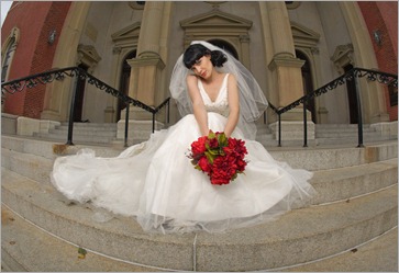
Take a look at the image below.
Here is what I love about the image:
1. I love the near centered symmetry of the image. Look how with the railings lead your eye from the outside of the image directly to the bride.
2. I also like the use of the fisheye in this image. Even with the fisheye distortion, I don’t think it detracts from the photograph. Plus, it’s super easy to fix in Lightroom 3 with the lens correction controls.
3. I like the easy pose on the steps of the church. I, myself have never been a fan of sitting the bride on church steps. Call that a slightly dated reaction to the days when it was nearly impossible to get the bride anywhere near the ground with her gown. Brides today don’t seem to care about that as much and quite often will sit down.
4. I like the centered positioning of the bouquet in the image as well. With the bride’s nearly centered position and the same for the bouquet, the viewer’s eye only has one place to look – at the subject.
Now a few points about where we see the near misses:

2. I sure wish the light had been brought in from camera left and positioned to place a nice dimensional loop lighting pattern on her face.
With the light coming in from camera right like we see in this image, it really broadens the subject’s face hence the term broad lighting. Broad lighting is usually the most unflattering lighting to use on your subject because it makes them appear much heavier than they really are.
3. I really don’t like the near centered symmetry of the image. I know I said that’s what I loved about the image above. What I loved was that it was almost centered – I just wish that the bride had been perfectly centered in the image. That was the near miss for me about this image.
Look at the next image:
I moved the bride over a bit more to the center of the image. Still the image is not quite “singing” to me.
Let’s move her over just a bit more to the center of the steps (Thank goodness for Adobe’s content aware fill.)
Now the image really starts to come alive compositionally. The bride needed to be centered on the steps for the best photographic impact. Now we have all lines leading directly to her. When you compare this image with the first image, the first image, for me, is like a gong going off. Ouch, it just misses the mark because of the none centered position of the subject.
You know, it’s the little things that count. It’s the little things we need to be aware of to make our images stand above the competition’s. The next time you set up a shot, give it a quick once over visually just to double check that all the little things are in place. That quick second check can make all the difference in the world.
______________________________________________________
Hey gang, that's it for me today. NIK software is undergoing renovations at their headquarters and I thought I would head over and say HI.
How about I see everybody tonight for the kick off of city #1 of Captured By The Light. I hope to see you in San Diego. And if we miss each other tonight, I hope to see you right here bright and early tomorrow morning for another scintillating episode of Business Day Thursday.
See ya' then everybody, David


No comments:
Post a Comment