Good Afternoon Everybody,

Thanks to everyone who offered suggestions on how to get the best color from Costco’s printing services. I thought the best was the online upload of the images and even gave it a try. It really works quite well. The only problem – I can’t pick them up at our Cabo Costco it only works in the states. Back to Plan B – try to QC the printing at the store, language barrier and all. I’ll keep you posted. There’s bound t0 be a lesson in here somewhere ;~)
That’s the latest update from this part of the world so let’s get on with todays post. Hope you enjoy it.
Doing Print Competition Right!

I thought yesterday was a great post first, because it was jammed packed with great images and secondly, because if you hit the PPA links near the end of the post, you got some great insight as to what the judges are looking for in an image.
Today, I want to ramp it up another notch and point out one of the easiest things you can do to your images that almost guarantee a point or two increase in your score. And that, is the image presentation.
Key Lining Is A Nice Touch
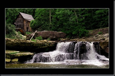
In our image competition we saw some great images but what was it that set the winners apart from so many other entries? It was how they were presented to the judges. Let me show you what I’m talking about. Let’s look at the first image below.
I remember when this image came up on my screen – I loved it! It was beautifully photographed and had quite a dramatic feel to it. What it was unfortunately lacking was a better presentation.
Hey, I know this “image competition thing” is new to many of you which is why I’m taking the time to share with you some tried and true secrets of the top competitors.
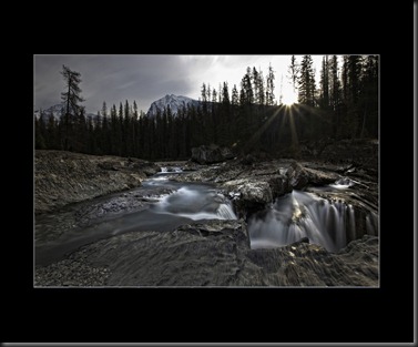
Now let’s look at the next image.
Again, we have a striking image. I have to admit, I like the blurred water in the first image better. So what is it about this image that adds a bit of a coolness factor to its presentation? It’s the key lining around the image, isn’t it? The very small line around the image makes it seem to pop right off of the page.
Now what happens if we do the same thing to the first image we looked at. Check it out below.
The thin little key line did a nice job of really showcasing the maker’s image. I also punched up the flowing water’s highlights by using the dodge tool in “highlight” mode. It made a BIG difference, didn’t it?
Slim Line Cropped Images
Check out the next image below. Kind of different isn’t it? What makes it so different – the super slim crop. It’s so different from the majority of the images submitted. And, it’s that difference that catches the judges eye.
To add an element of surprise by adjusting the print presentation is a favorite technique used by many master photographers over the years. This image did not score as high as I would have scored it, but that’s what image judging is all about – differences of opinion. During a regular competition like we have scheduled for PhotoPro Expo 2102 in February, the five person judging panel will really get “lively” as they challenge, discuss, and re-score the images. It’s exciting to watch.
Match The Mounting To The Background
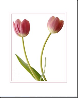
Let’s take a look at the next image. I think it’s gorgeous! It’s simple, elegant, and beautifully presented.
It’s the “white on white” matting of this image that makes it so striking for me. Do you see what the maker has done? Instead of just presenting the image on just any color background, white was used to compliment the solid white background of the tulips. Key lining finished the job for a great image presentation.
Key The Key Line
Let’s take a look at one more image. Again, it’s just a simple, yet beautiful bridal portrait. But what makes it stand out as a great image presentation?
Click on the image to make it larger and notice how the maker used two key lines in this case, each key line picking up the subtle tonalities of the yellow bridal bouquet. The maker of the tulip image above did the same thing. Both image just seem to jump off the page.
So there you have it, a few ideas, tips, tricks, and techniques of the trade that you can use the next time you enter a image competition.
Good luck!
_____________________________________________________
We have just a few more days remaining in Mexico and we’re planning to enjoy every one of them. The sunshine is calling and I don’t want to be late so I’ll catch you later. Have a great one!
See everybody tomorrow.
-David


No comments:
Post a Comment